Center Theatre Group
Refreshing the story and visual identity of a leading theater company.
Brand Identity and Guidelines
As it approached its 50th Anniversary, Center Theatre Group faced a singular opportunity to rethink and refresh its story and visual identity, as well as those of its three theaters. A key objective for the project was to shift Center Theatre Group from a hierarchical “umbrella brand”—presiding over its theatres—to one in which the identities of the Ahmanson, Taper, and Douglas thatres enhance that of the organization overall… and vice versa.
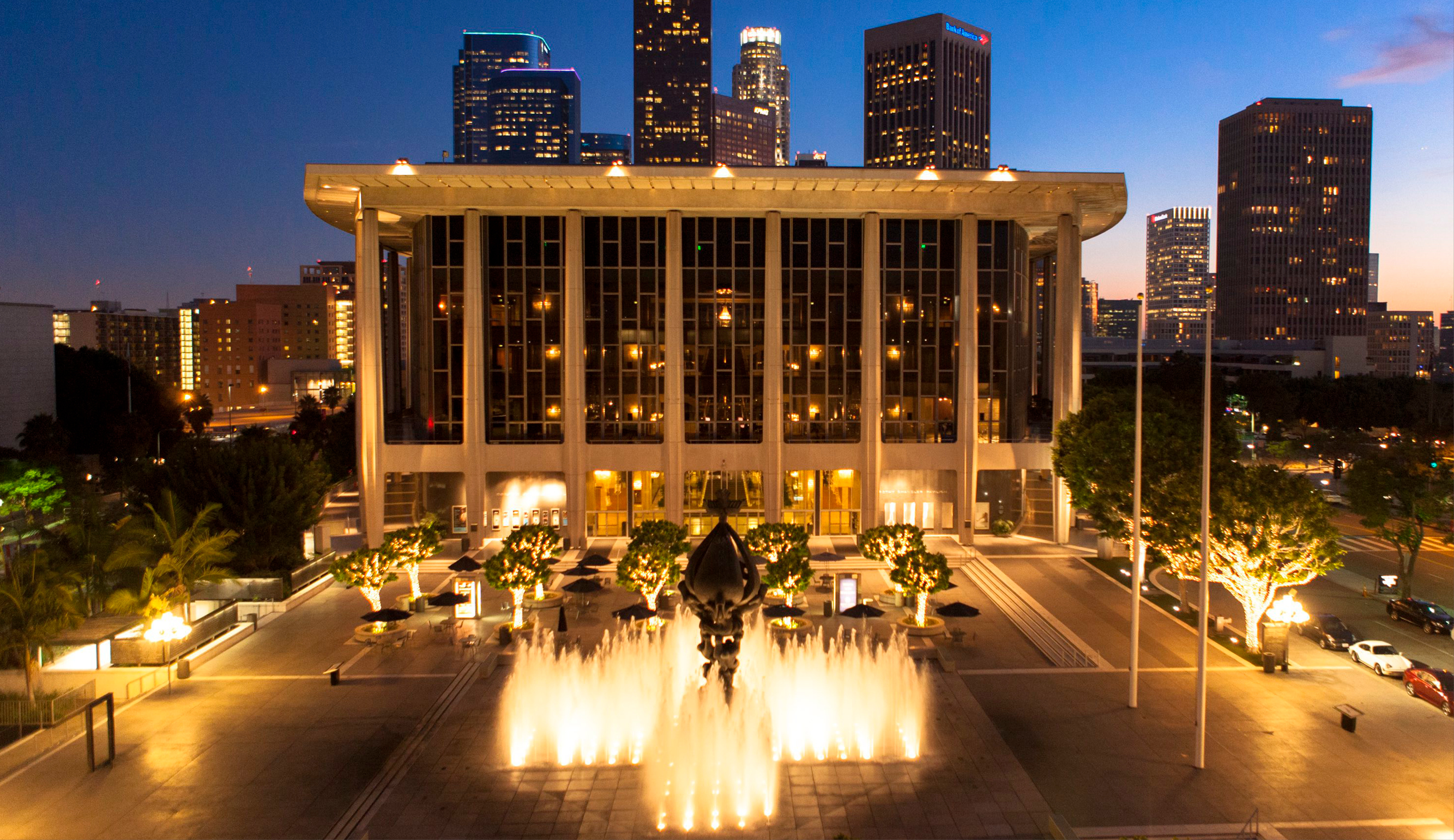
Photo Credit: Alex Pitt.
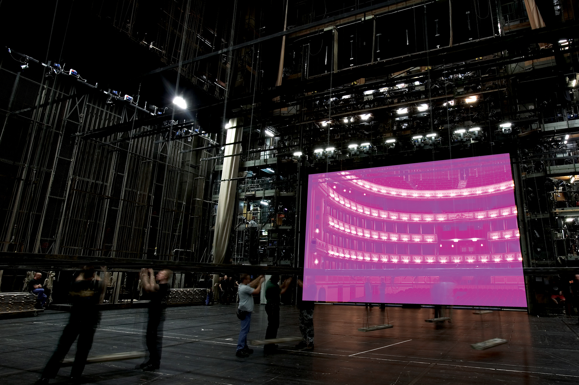


The inspiration for the new identity system came from theatre itself, and its ever-present contrasts: between comedy and drama, light and dark, offstage and center stage. The hidden and the visible, and the fact that much of what audiences see on stage is only a fraction, but the essence of what goes on behind the curtain. Based on the same idea, the visual identity of each venue and CTG were developed on only the most essential and minimalist parts of their typographic symbols, in combination with their full name.
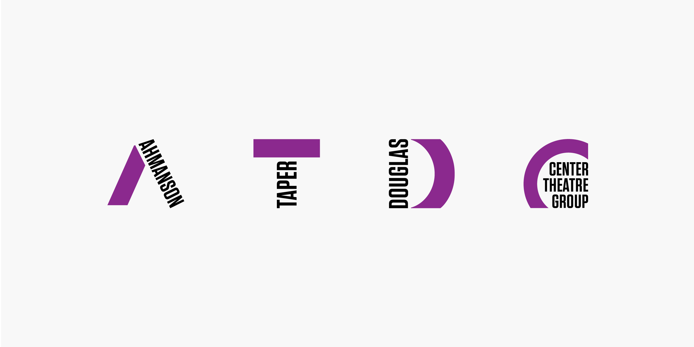
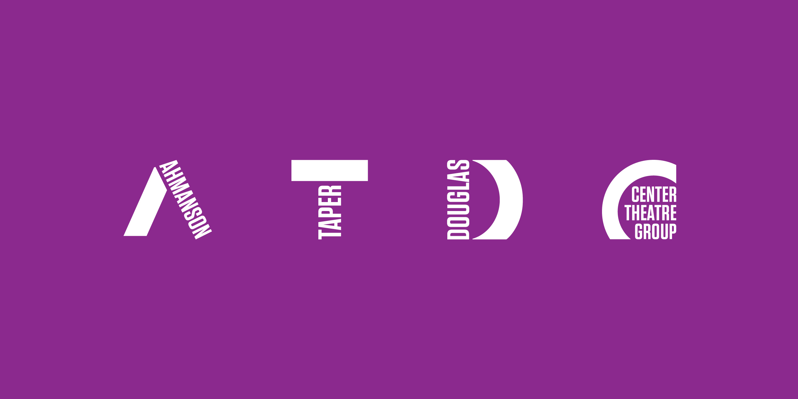
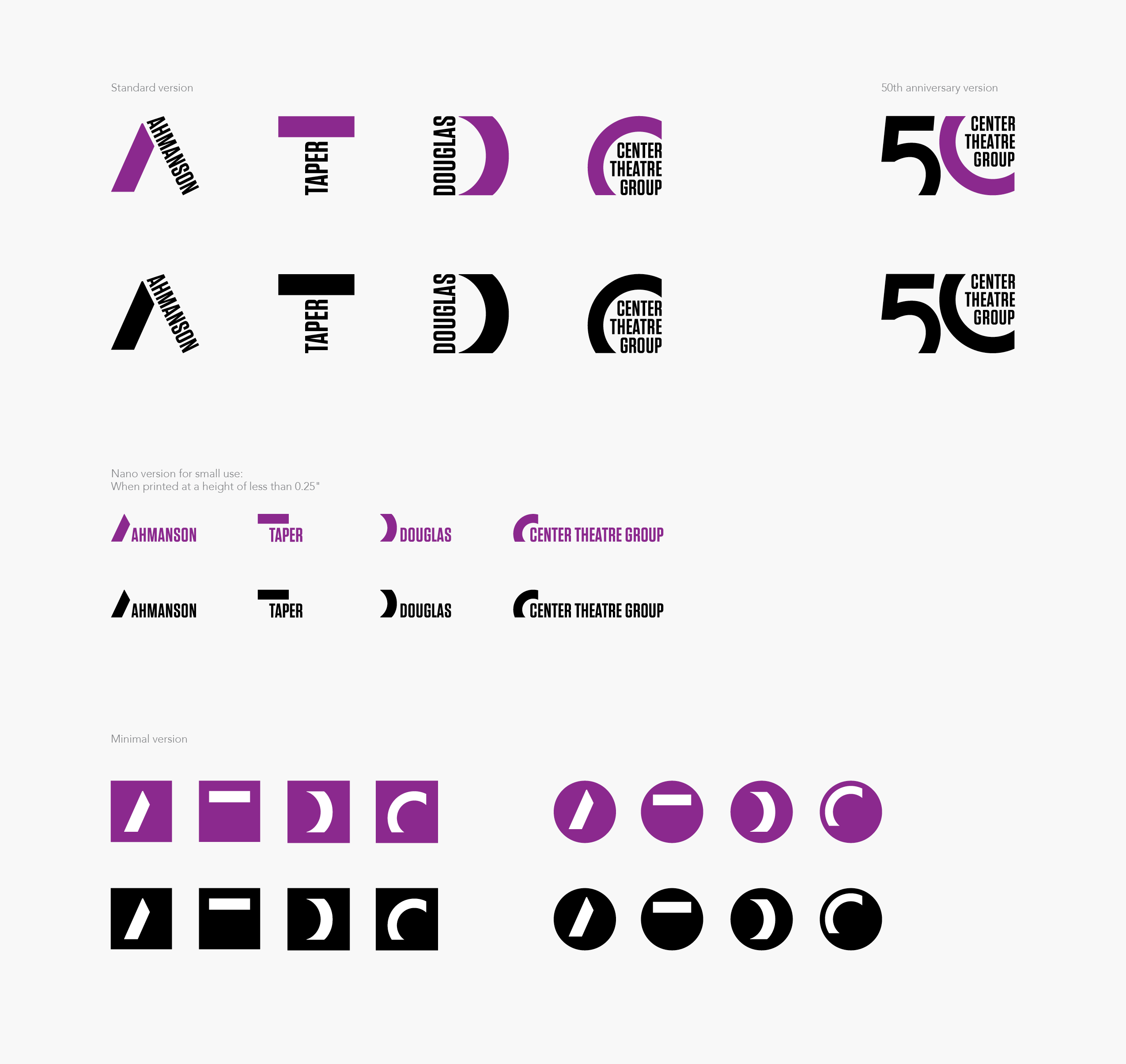
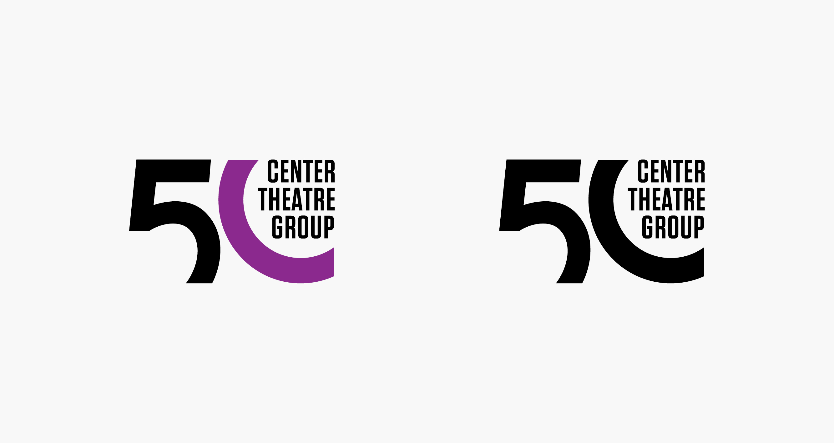


Bold typography and a bright, fun, and contrasting color palette gives the CTG identities a new and bold look—and allows them to be distinct from each other. Sharing a similar visual language keeps all of the identities of each theatre in the same family.


Bold typography and a bright, fun, and contrasting color palette gives the CTG identities a new and bold look—and allows them to be distinct from each other. Sharing a similar visual language keeps all of the identities of each theatre in the same family.

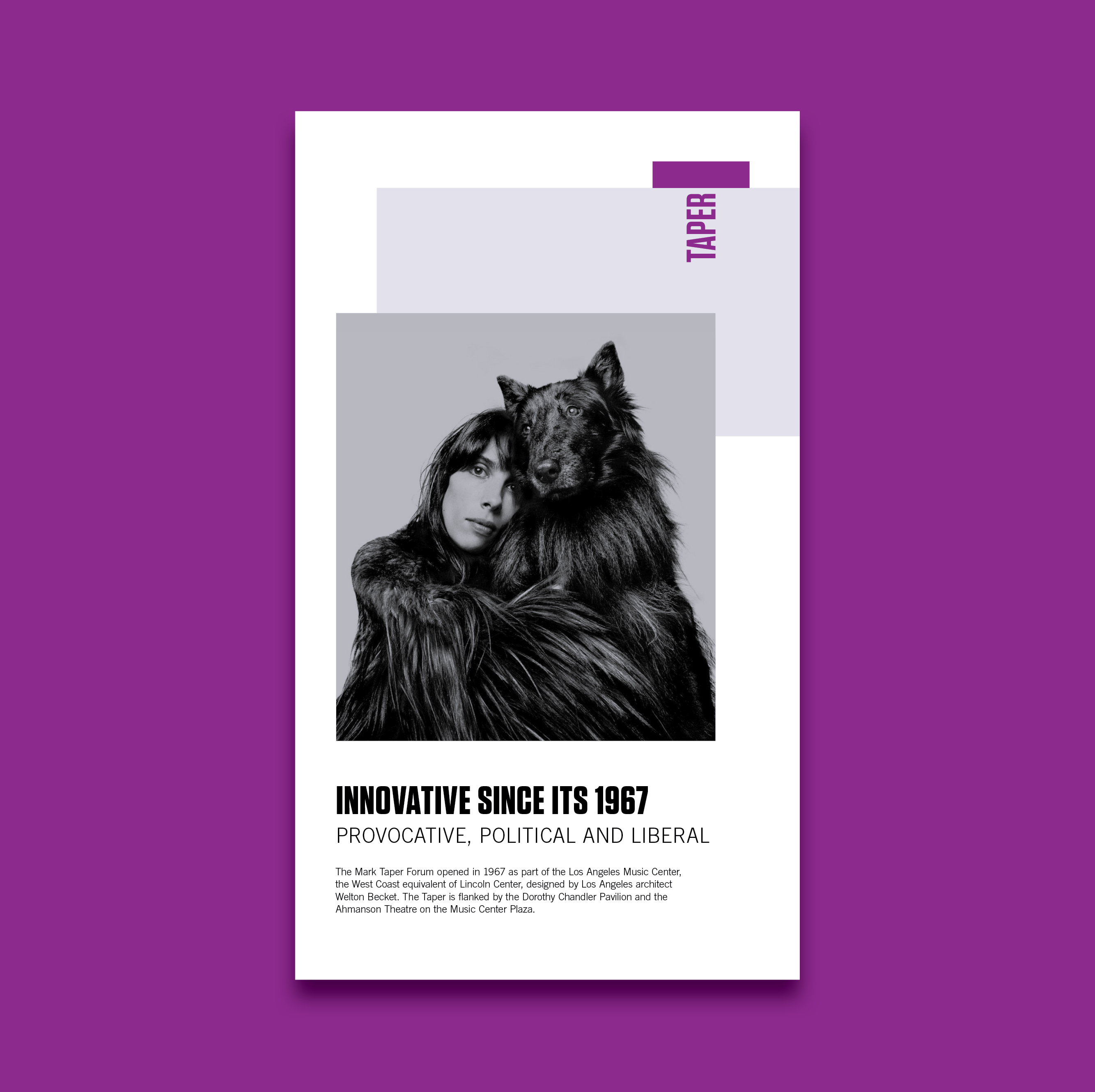
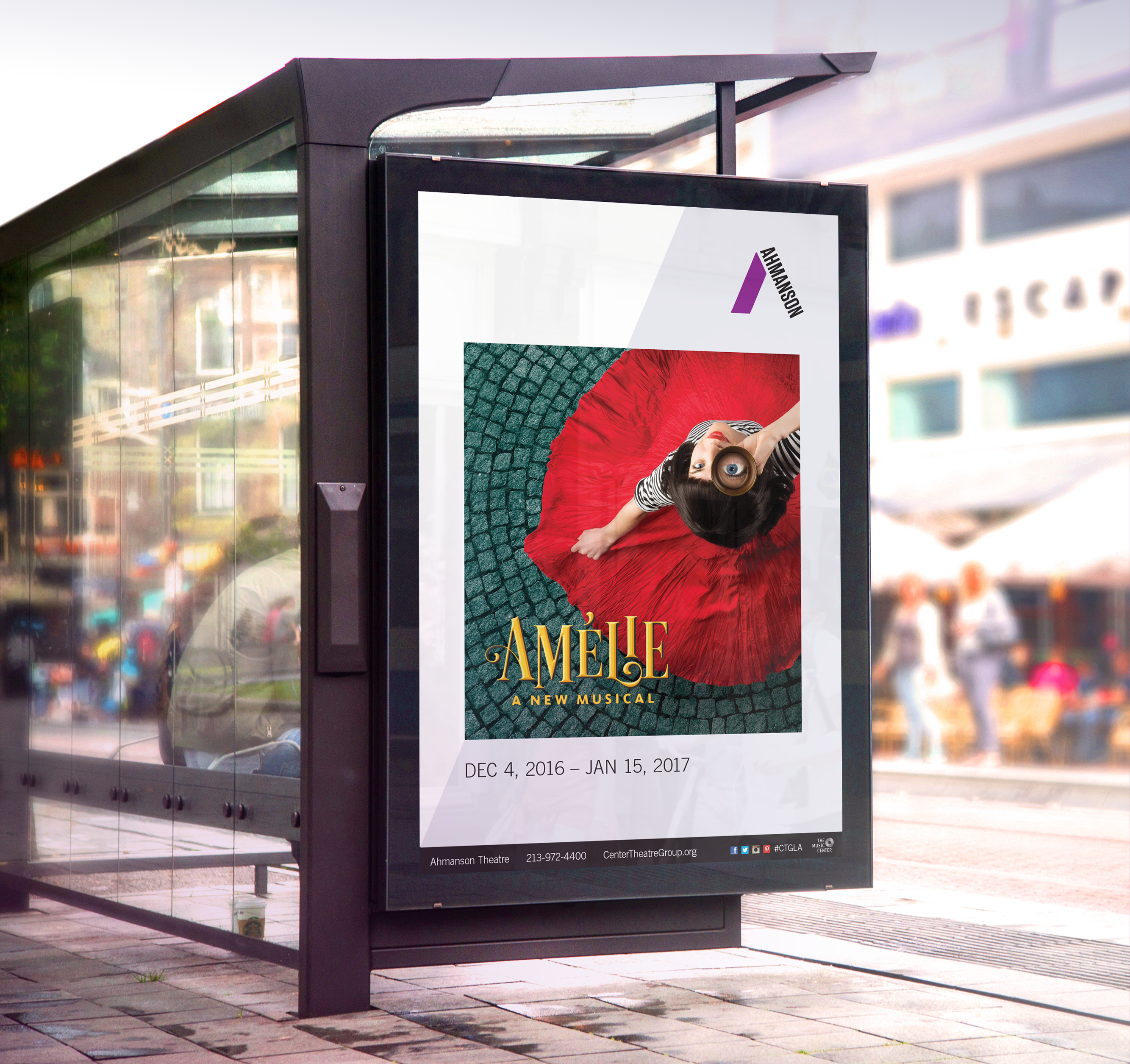
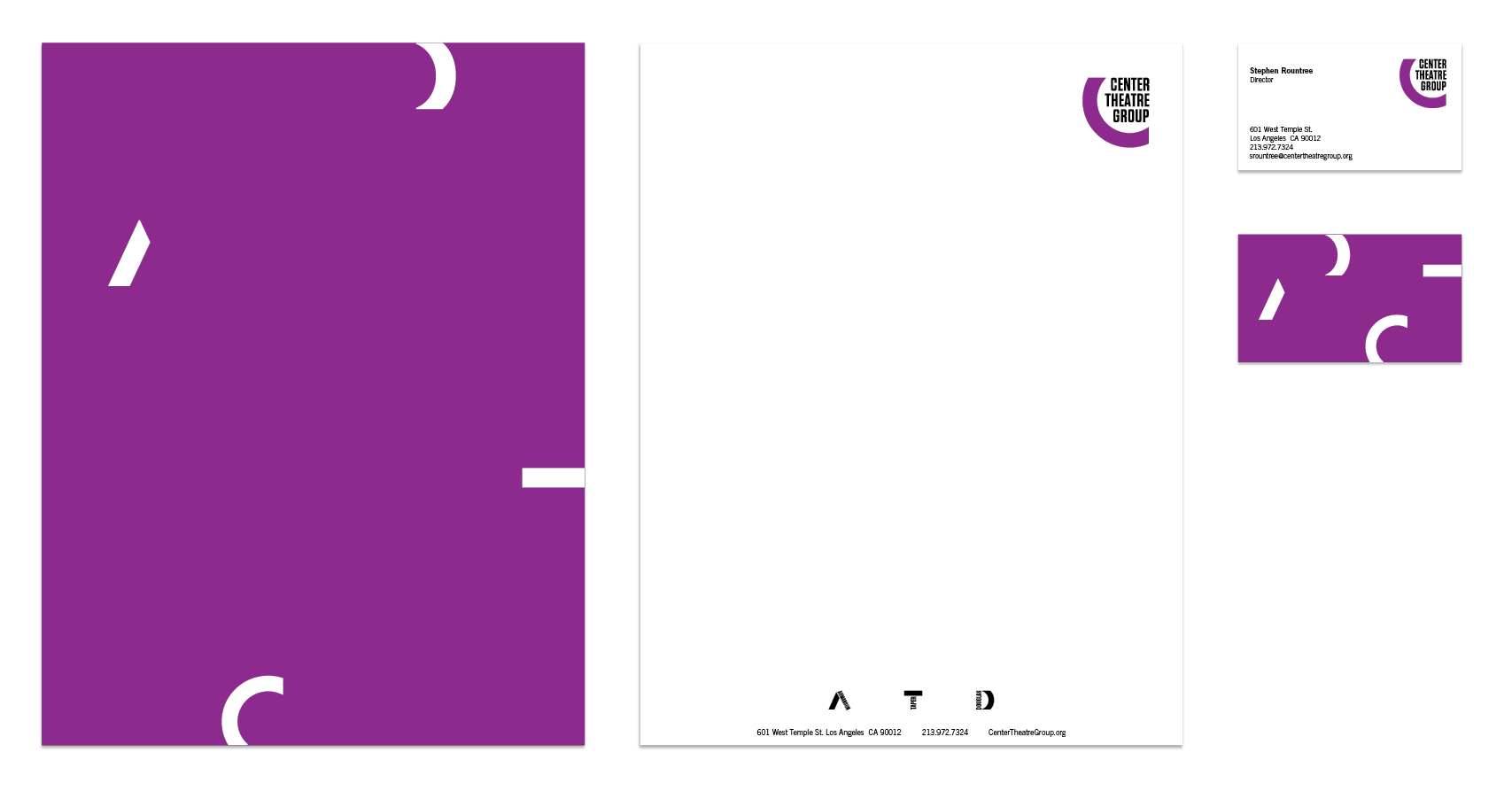
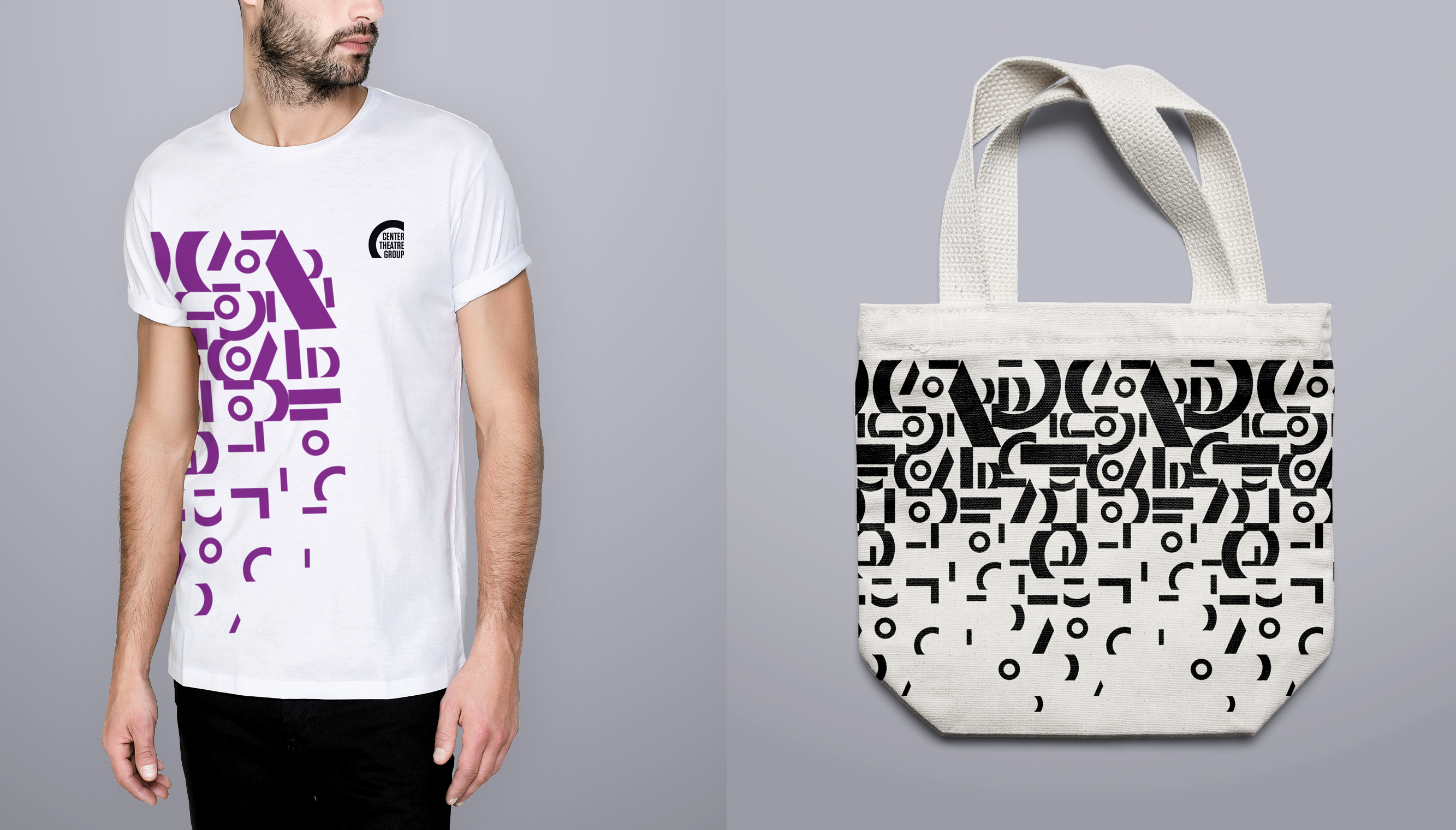
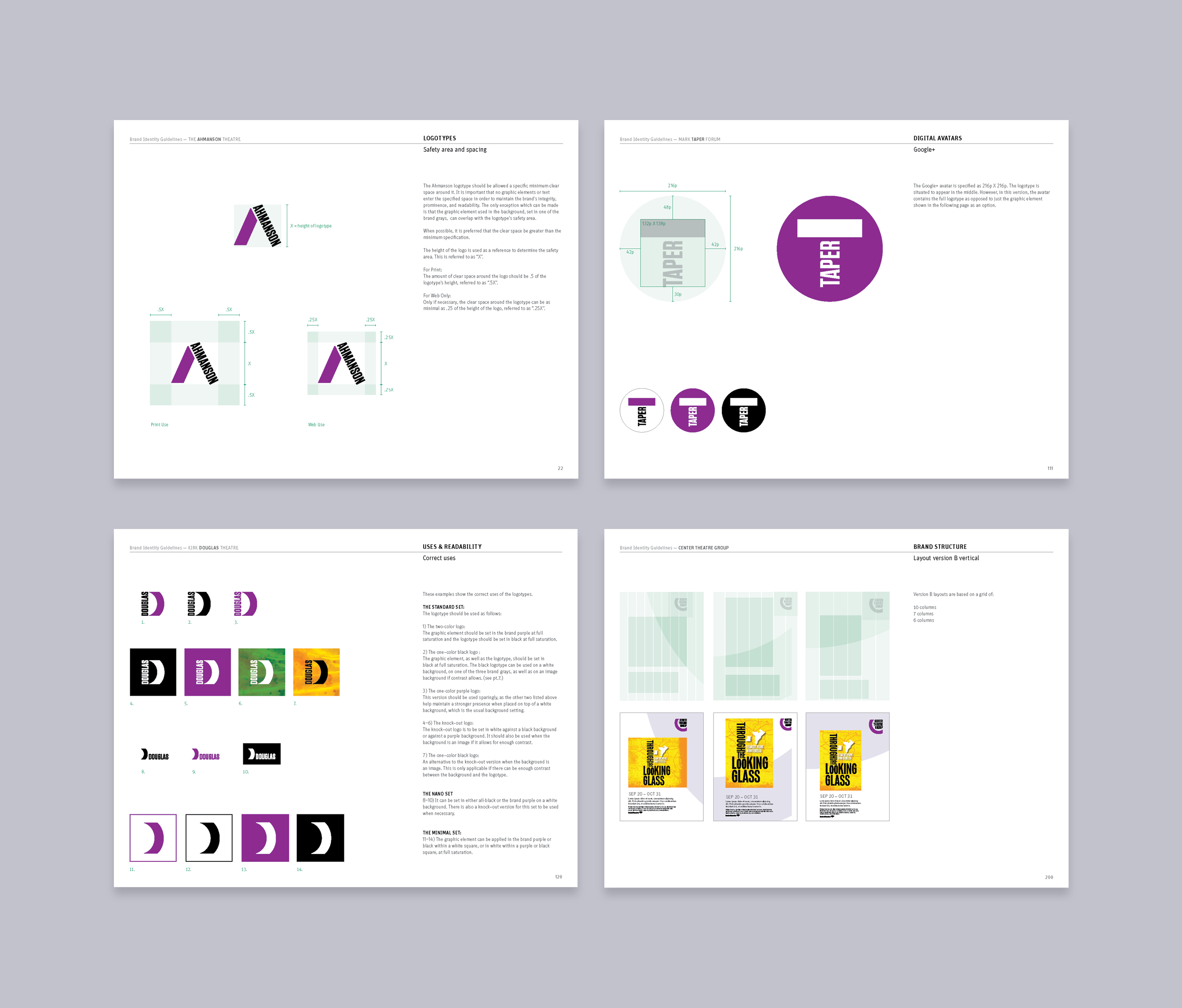
An array of graphic elements and colors were established in an extensive set of guidelines to activate the brand across a variety of different channels, from on-site collateral to advertising, and social media.
